BriefSpec lets you switch between a light and dark theme. It’s a per-user preference stored on your device, so your choice follows you across projects and sessions — and it doesn’t affect anyone else on your team. This guide shows you where the switch lives and what actually changes when you flip it.
Prerequisites
None — theme switching is available to every signed-in user regardless of role or plan. The setting is stored locally in your browser, so it applies to the device you’re on rather than following your account to a different machine. If you sign in on a new device, that device starts with the default light theme until you switch it.
Where the Theme Toggle Lives
The theme toggle is in the top bar, on the right side — the moon/sun switch next to your avatar:
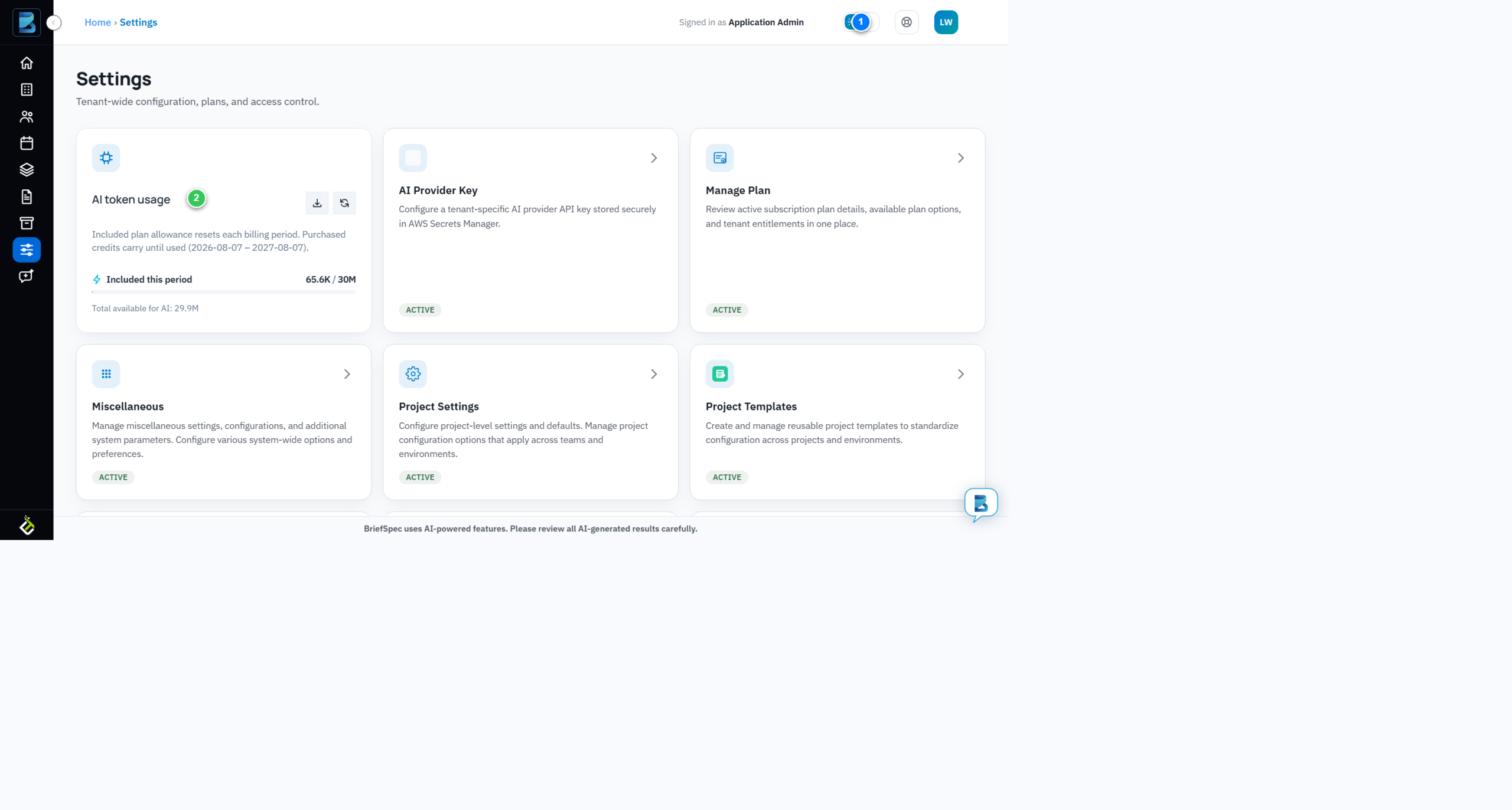
- Theme toggle (1) — a moon/sun switch. In light mode it shows the sun; clicking it switches to dark mode.
- Page content (2) — everything below the top bar renders in the current theme. Here the Settings cards show the light theme: white cards, dark text.
Switching to Dark Mode
Click the theme toggle (the moon/sun switch). The entire interface re-renders immediately:
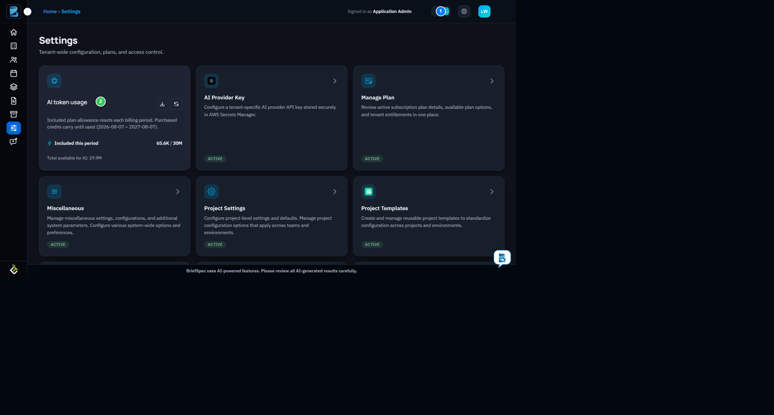
- Toggle state (1) — the switch now shows the moon, indicating dark mode is active.
- Dark theme (2) — the same cards are now dark navy/charcoal with light text. Note the page is otherwise identical: the toggle changes appearance, never layout or functionality.
To switch back, click the toggle again. You can flip between the two themes as often as you like — there’s no limit and no reload required.
What Actually Changes (and What Doesn’t)
The theme is purely cosmetic. It adjusts colors, contrast, and icon tints — but it never changes:
- What changes: background and surface colors, text color, borders, icon tints, and card/chart colors. Everything is themed from the same token system, so dark mode stays consistent across every module — projects, backlog, defects, plan, and settings all follow the same dark palette.
- What doesn’t change: your data, your layout, your feature access, and your permissions. A defect is still a defect; a phase is still a phase. The toggle only affects how things look.
Why dark mode matters in implementation work: consultants often work in low-light war rooms, client sites, or late-night test cycles. A dark theme reduces eye strain during long test execution sessions, and — anecdotally — makes the high-contrast status badges and defect highlights easier to scan at a glance. It’s a small preference with a real comfort payoff on long engagements.
Theme Scope: Per-User, Per-Device
Your theme choice is yours. It’s not a tenant-wide setting — changing your theme doesn’t change it for your colleagues, and an administrator can’t set a theme for everyone. If you share a device with another consultant, each of you can switch independently (though the browser stores a single value, so the last person to toggle wins on that device).
What’s Next
- Manage your profile to update your name, photo, and contact details.
- Navigate the Settings page to understand every account-level option available to you.
- Manage your plan & subscription to review billing and utilization.